theme_set(theme_minimal())
#help(package = 'RColorBrewer')
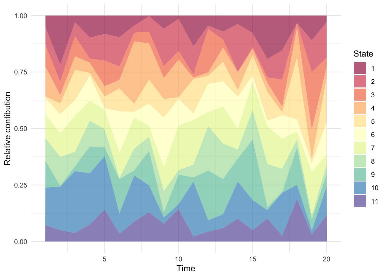
nr_of_clones <- 11
nr_of_timepoins <- 20
dat <- tibble(t = rep(1:nr_of_timepoins, each = nr_of_clones),
p = abs(rnorm(nr_of_clones * nr_of_timepoins)),
s = rep(1:nr_of_clones, nr_of_timepoins))
dat$p <- dat$p / rep(tapply(dat$p, dat$t, sum), each = nr_of_clones)
# my_cols <- rainbow(nr_of_clones)
my_cols <- brewer.pal(nr_of_clones, 'Spectral')
(g <- ggplot(dat, aes(x = t, y = p, group = factor(s), fill = factor(s))) +
geom_area(alpha = 0.65) +
scale_fill_manual(name = 'State', values = my_cols) +
xlab('Time') + ylab('Relative contibution'))